Logos, like paintings, are subjective but, unlike paintings, logos have a job to do: to communicate the identity of a business, organisation or brand.
This is one of the most difficult disciplines within graphic design because not only should a graphical representation of the business, organisation or brand be included, but there are a whole host of other factors that must be considered:
Timeless:
The logo should not include currently trendy or fashionable ‘effects’, fonts, colours, textures or other elements not directly connected to the business, organisation or brand, unless the logo specifically has a short – and current – shelf life.
Memorable:
The logo should be unique to the business, organisation or brand and not rely on commonly used ‘clip art’. Ideally, the iconographic elements of the logo should be originally created (or, at the very least, adapted from existing graphics or fonts). This is where the flare and experience of the designer comes to the fore though, paradoxically, it’s also where the client’s opinion and taste can differ and, unless there is agreement here, a good logo design can be born or killed.
Simple:
When reduced in size, a good logo should remain perfectly readable. In the case of having to include a long word (or words), or a fiddly graphical element, it is not uncommon to create two logo versions: a ‘standard’ version and a simplified version which can be reduced greatly. The latter usually involves dropping or simplifying any long text blocks and sometimes simplifying any iconography. The logo must be able to be reproduced almost anywhere. This will mean a simple black and white version should also be created, which remains true to the original. Such a version will usually be needed at some point, whether it’s to be printed at the top of a till receipt or engraved onto a glass bottle and it’s always better to account for this at the design stage, rather than to try and ‘botch’ one together later.
Versatile:
The background surface, upon which the logo will be reproduced, should always be considered and a version of the logo should be created for use on darker or pictorial backgrounds, however complex. This might manifest as a white outline to the logo or even a full white and transparent version being created. Again, this should be a consideration from the start and not an afterthought.
Adhering to these main considerations will ensure that even if you and the designer disagree on the aesthetics, the finished product will be professional and will adhere to the best logotype ‘standards’, irrespective of the brand.
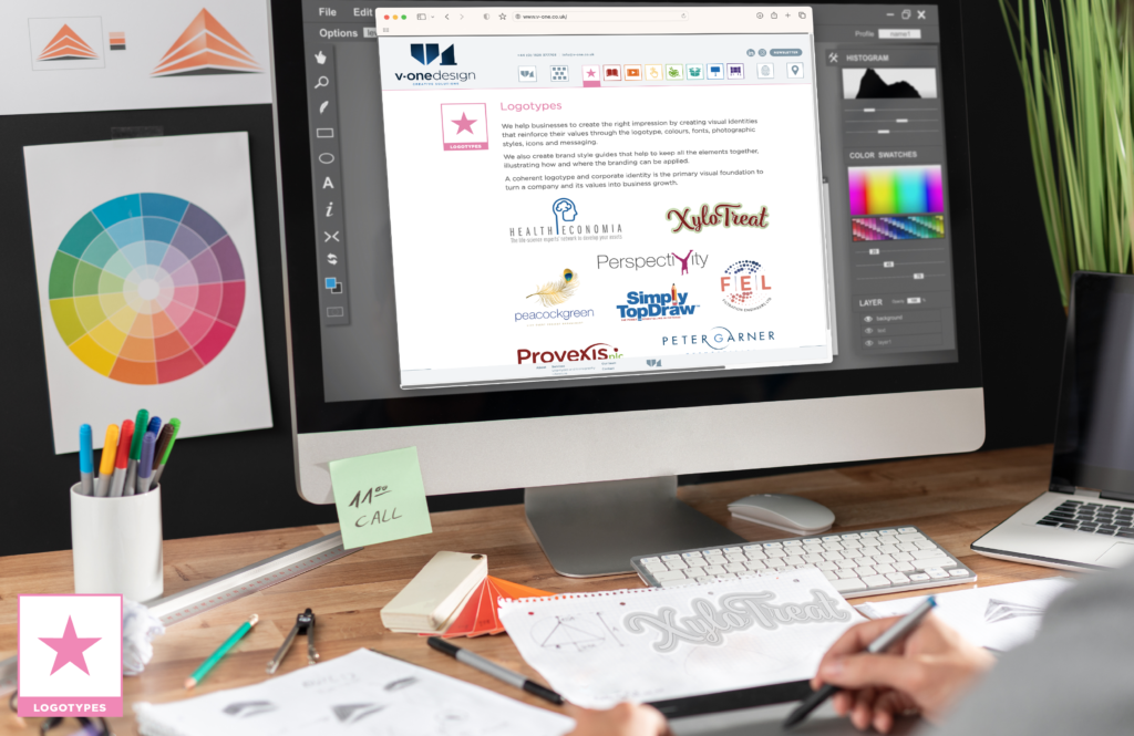
For more information on our logotypes click here.