Animated or static web site banners are one of the most widespread advertising tools but you’ll be aware that this can be a crowded place.
These mini advertisements occupy the smallest of spaces – often sitting amongst an array of competing advertisements – so it’s vital to make the very most of every pixel if the right impression – and sale – is to be made.
Here’s a checklist of considerations for all banner ads – animated or static:
Don’t forget the brand
It goes without saying but it’s worth repeating that all banner ads should follow the brand’s corporate identity and fall in line with their other collateral. If your banner doesn’t look like it belongs to the brand, the message is half lost already!
Keep it simple
Whether creating animated or static banners, this is the golden rule! Remember, the viewer hasn’t requested to see your ad. so ensure the key message can be read and understood in a second or two – even in their peripheral vision. This means keeping text short and concise and ensuring any images or graphics don’t obscure or clash with the text; they should contrast one another. And don’t feel that empty space needs to be filled. A clean and uncluttered banner is more likely to be read than one filled with content.
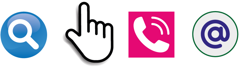
Use iconography
Sometimes, an icon or graphic can communicate a message far better than spelling it out in words.
Flexible layout
Ensure the individual components on the banner can be clearly separated. So, for example: (1) headline, (2) main graphic (3) sub-heading (4) call to action can be repositioned for different formats of banners (tall and thin, square, wide and narrow). This will ensure that, whilst the layouts will differ, the overall look of the banners will be consistent and unified.
Remember your audience
It’s easy to create a ‘one-size-fits-all’ design style but tweak this to suit the audience to appeal more to kids, the elderly, sports fans, women, trendies etc.
Animate sparingly and cleverly
Always remember that your banner is sitting on a web page where the user is more interested in viewing other content. Find the balance between drawing attention and causing a downright distraction. Keep animations to a minimum; one or two text changes or something clever with the graphics. And don’t animate for the sake of animation especially repeatedly flashing the same text. If you’re animating more than one block of text, ensure that each block remains on screen long enough for the viewer to actually read it (plus 50%) before moving on to the next block.
Call to action
What do you want viewers to do? Then tell them! But remember that your banner is just a shop window meant to ‘invite’ the user on to other things – not a full-blown sales presentation. A simply ‘click here’ is all that is required to invite the user to view more information.
Click here to see what we can offer for your business’ digital needs.