A piece of literature – whether it be an advertisement, an invitation, a leaflet, brochure or newsletter – has one, sole purpose: to provide information. However, in this fast-paced, digital age we find ourselves in, information will only be consumed if it’s delivered in an engaging, inviting, clear, and eye-pleasing way. And this can only come about through good design.
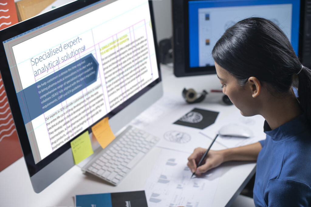
Most items of literature are created using Adobe InDesign, the professional, industry standard application for desktop publishing.
Good design in desktop publishing enhances readability and boosts credibility. It projects a level of professionalism, authority and believability that boosts the image and perception of a brand. Bad desktop publishing delivers the opposite and can actually help to damage a brand’s identity.
I have many years’ experience in desktop publishing and I’ve touched on five of the most important aspects of creating a layout that will draw readers in and enable them to digest the information easily.
Deciding what’s most important.
If everything has to stand out, then nothing will stand out. So ensure the reader hooks on to one main attraction on the page. It might be an image a graphic or a headline, but keep it clean, clear and simple. The remaining bulk of content can then be added – as secondary importance. Don’t worry… it will still be read! Enlarging text, boldening it, colouring it and otherwise trying to draw attention to it should be kept to an absolute minimum; too much will simple add a level of clutter that isn’t very pleasing on the eye. And it can look pretty messy! Make sure there’s a clear direction in the reading order. Any text that’s not too relevant to the page but might need to be there for legal reasons, for example, should be demoted to the outer reaches of the page.
Margins and grids:
These are the very foundations of good layout design though, proportionately, they differ across document types. A white paper, for example, might have slightly larger margins and column gutters to ensure there is enough ‘white space’ in these, traditionally, text-heavy types of documents. A good grid structure is imperative for comfortable alignment throughout larger documents, such as brochures and books, to create consistency.
Consistency:
Maintain a small number of fonts, font weights and sizes in any one document. The same applies to the use of colour and the style of illustrations and photography. This will provide a clean, eye-pleasing canvass that is pleasant to read and digest.
Balance:
The symmetry and balance of a page or spread will help the reader rest their eyes comfortably and not be distracted. This includes ensuring line lengths of text are similar (don’t ever leave a widow – a single word – on a line on its own!), columns are balanced, and that heavy content sections are balanced with ‘fresh air’ – clean, light, airy or no content – elsewhere on the page or spread.
White space:
One of the most over-looked aspects of page layout is ‘no content’. But it’s just as important as ‘content’ in delivering a well-ordered and informative page. Think of it as page feng shui; no one wants to sit and relax with a cup of peppermint tea in a room scattered with kid’s toys, a stack of un-ironed clothes in the corner and dirty dinner plates waiting to be washed up.
The same is metaphorically true of page layout. If you have a lot of content to get across, consider adding more pages rather than cramming it all into a tight space. Your readers will appreciate it!
Milly Austin, senior designer / studio manager